Karim Rashid, who stands out as a unique combination of the warm and rich culture of Egypt and the creative power of Canada, is one of the bright stars of industrial design. Rashid, who is acclaimed for his designs in a wide range of fields from luxury furniture to lighting, from surface design to brand structure, draws attention not only with aesthetics but also with functionality and forward-looking perspective. We talked to Karim Rashid, known as “America’s most famous industrial protector” and “Prince of Plastic”, about his design philosophy, inspirations and dreams.
Could you briefly tell our readers about yourself and your professional background?
I was born in 1960 in Cairo, and after a year, we moved for a short time to Rome. My father was working with Egyptian television as a designer and then with Cine citta in Rome for a short time. Then we moved to Paris. My father had an exhibition and then he decided to move on. My mother’s British and she wanted to go to England to be near her family after five years abroad. So, then we moved to London, and I was young, about two and a half. My first formative years were in London. I was very young, about six when we moved to Canada, which was very different than England despite their linguistic similarities. I remember my first experiences from then on. We have differences in how much we remember our childhoods. I remember very little of mine. It’s strange. My first really strong memory was on the ship going from London to Montreal. We were on the Queen Elizabeth and there was a drawing competition which I won.
I was confused as a teenager of what profession I would go into. I had accelerated high school, so I was 16 when applying to university and was torn between architecture, fine art, and fashion. I originally applied to study architecture at Carleton in august so I much too late and the program was full. They told me they could accept me in the ‘architectural stream’ of Industrial Design. So, I went to Carleton university expecting to study architecture, but fate had it, that the second I took some industrial design courses, I knew that it is what I wanted to do. I assumed that one had to be an architect to design a chair or coffee machine or a product. I loved the Italian product design landscape and all those products that I admired for years that were in our house were designed by architects. In fact, Italy did not have an industrial design school until 1984. The Carleton program was only in its’s second year so in turn, and not enough faculty or courses in industrial design, so the greatest experience I had was to study engineering, architecture, philosophy, languages, and have such a broad diversity of courses. I have concluded teaching for so many years that a designer needs a broader experience, and in fact, I believe that design should really be only taught in graduate school.
After college I went to a one-year graduate program in industrial design in Italy studying with Gaetano Pesce and Ettore Sottsass. Sottsass taught me that there are many beautiful design objects, but that you have to ask what they do for us? In the sense of human, inspiring objects, Memphis was a revelation and a turning point in design. There are many imposing design objects who need to stand by themselves to impress. I always ask myself, what is left, if you take the design away? If it’s style, it is a thing of the past. I define design as embracing contemporary criteria to shape the future, not being derivative of the past
Later on I was a part-time professor in Toronto at OCAD in interior design and taught furniture design at university of Toronto school of Architecture. Then I recived a full-time assistant professorship at the Rhode Island school of Design (RISD). I was going to quit the design profession and become academic since at this point I fet very uninspired. But in 1992 when I was fired from RISD because I was told I was teaching ‘philosophy and theory’, not design, I decided to get back into the profession. I loved academia but I’m grateful to have been let go because it prompted me to start my own firm in NY in 1993.
My career really started in 1993 (when I was 33) when I moved to New York City. I was penniless in NY but started drawing objects romanticizing the beautiful world I always wanted to shape. I found a rundown loft without a kitchen or bathroom and struggled to survive. After approaching about 100 companies from Lazy boy to Gillette, I only got one client. And I started teaching at Pratt Institute and worked alone for a few years before hiring some staff. I was determined to create a successful practice.
What is your design philosophy, how do you get inspired during the design process?
Generally, I am interested in showing the world how a contemporary physical world can be warm, soft, human, and pleasurable. My aesthetic is very human and I think it translates well to these sensual objects/spaces. I always design within the realm of my philosophy of sensual minimalism (soft, comfortable, human, with character yet reductive). What is more human than ourselves!
How do you evaluate the impact of your design on society and the environment?
It has been my mission to make design a public subject. I preach about how design shapes the future. I believe that design is extremely consequential to our daily lives and can positively change the behaviors of humans. Products and furniture must deal with our emotional ground thereby increasing the popular imagination and experience. Good design can shift and change human behavior and create new social conditions. Human beings touch an average of 600 objects a day, and the potential for those objects to benefit the everyday human experience is immense. I derive tremendous happiness from product design because each object has the potential to connect with the consumer and to bring them pleasure on an everyday basis. Beautifying the world, creating well-designed, provocative, stimulating products and environments is the impetus for everything I embark on.
What do you think about Turkey’s design culture?
The Turkish culture, the people, the food, and the intellect is very vibrant. I am very optimistic about the future of Turkey because I find that when I work with small entrepreneurs many of them are so sharp and on the pulse of our ever-vast changing lifestyles that they generally have success and can become a recognized brands overnight. But companies can be too slow to innovate and understand the value of design, unlike the Italians who have made it their heritage. I am working with a few Turkish brands right now and I cant wait to show the world the incredible collaborations.
Why do you prefer materials such as marble and natural stone in your design and what is the effect on your design?
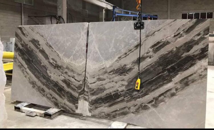
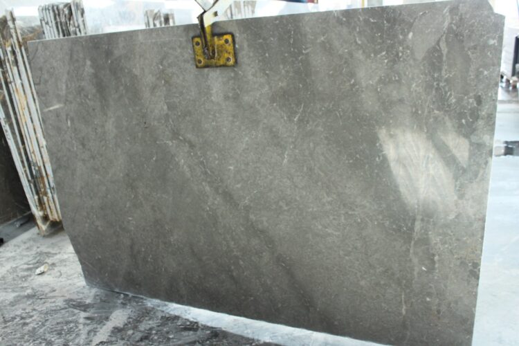
Typically, when we think of marble, we think of classical sculpture and antiquity. Consumers think of marble as being so hard and imposing but really it can be quite soft and sensuous. I wanted to bring marble into the now. The natural swirls on the surface of the smooth marble perfectly complement the organic forms of the furniture. Creating inspiring objects is what drives me, and the opportunity to bring my marble/natural stone collections to life, bringing the best out of the material and the design, is really thrilling.
What are the advantages and disadvantages of marble and natural stone in terms of sustainability?
Marble and natural stone are beautifully sculptural. The form and material can have a great duality depending on the design. Marble is expensive, very heavy to transport (waste of energy), inefficient, and an ‘old idea’ of luxury. The perception as Luxury can be a hinderance. Today luxury can be defined as democratic freedom, that luxury is not anymore about diamonds, chandeliers, marble, and decadence, but instead about our new techno-casual age, that luxury is about lightness, affordability, flexibility, seamless technology that simplifies and improves everyday life. Luxury is about being inspired, self-expression, free time, and having new and original human experiences, about having greater pleasure with less materiality, mentally and physically!
How do users’ expectations affect your choice?
Although I am associated with strong colors and organic forms, I don’t design by form first. I ‘inform’ form. That means I focus on all the contemporary criteria at hand and respond and solve those issues. Hence my work has natural materials, monochromatic pallets, hard edges, and a plethora of diverse materials, depending on client’s brand, production process, material, technology, and the human experience I am addressing.
What is the most interesting design you have made using marble and natural stone?
I love the Ribbon Bench i made with A.A.T.C. Despite marble being so sculptural and imposing, collaborating with A.A.T.C we were able to create a striking bench that looks like two ribbons floating in space, The white marble forms defy gravity by creating an equilibrium of floating elements while the black marble creates a negative space which disappears into the background.
What would you say about new trends?
Outside of the Marble / Natural Stone industry the Ceramic Tile industry relies too heavily on antiquated trends and superannuated objects and styles. Everyone is trying to create faux marble or granite or an imitation of perceived luxury material. I do not think we should imitate materials artificially. There is so much potential and artistry in the craft of ceramic tiles that we should create designs that show its full worth and potential.
Can you share the names and features of 2 of your favorite projects?
The Venetian Gold marble furniture collection is what happens when metamorphic meets biomorphic. Comprising a chaise, table, chair, table lamp, floor lamp, stool, stool table, and two sculptural busts, the collection boasts dynamic fluidity and visual texture. Each piece possesses eye-catching characteristics. The stool and stool table appear shaped from one continuous band of marble, smartly coalescing into being. There is a playful asymmetry in the design of the chaise and rounded table lamp. The glass-surface table embodies balance and stillness, and the soft contour of the chair provides support and comfort. A muted, minimal palette of black, white, and grey allows the designs to speak for themselves. Abstract yet functional, the Venetian Gold collection is a harmonious fusion of traditional and contemporary.
Ikons by A.A.T.C. is another favorite. I developed the language of my icons over a period of 35 years. I can write prose with them. The symbols were non-lingual therefore not biased and anyone and everyone could interpret them as they saw fit. The beauty of abstraction will always be self-interpretation and higher spiritual meaning. Words are precise and forms are vague. I’ve used my Ikons across all my work, but this is the first time rendering them in beautiful marble. The resulting artwork really showcases A.A.T.C.’s beautiful range of marble selection and colors.


 +90 532 585 51 95
 +90 532 585 51 95